
概要
「スタイル」で説明したように、 WPF では、 HTML に対する CSS と同じ要領で UI 要素のスタイルを指定できます。
スタイルに加えて、 コントロール(ボタンやラベル、リストボックスなど)に対しては、 テンプレートと機能を使って、さらに柔軟なカスタマイズが可能です。 テンプレートを使えば、 背景色や文字サイズどころか、 コントロールの表示方法そのものを変更することが可能です。
コントロールテンプレート
Contorl クラス(Button などの親クラス)は Template という名前のプロパティ(ControlTemplate 型)を持っています。 この Template プロパティを設定することで、コントロールの表示方法を変更することができます。
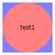
例えば、以下のように書くことで、ボタンの見た目を四角と丸に変化させることができます。
<WrapPanel
  xmlns="http://schemas.microsoft.com/winfx/2006/xaml/presentation"
  xmlns:x="http://schemas.microsoft.com/winfx/2006/xaml"
  >
  <Button Margin="5"
    Width="100" Height="100" Content="test1">
    <Button.Template>
      <ControlTemplate TargetType="Button">
        <Grid>
          <Rectangle Fill="#8080ff"/>
          <Ellipse Fill="#ff8080"/>
        </Grid>
      </ControlTemplate>
    </Button.Template>
  </Button>
</WrapPanel>

このような機能をコントロールテンプレート(ControlTemplate)といいます。
Button や Label など、 多くのコントロールは中身(Content)を持っています。 上の例では、ボタンの中身である "test1" が表示されていません。 これを表示させるためには、ControlTemplate 中に、ContentPresenter というものを書き加えます。
<WrapPanel
  xmlns="http://schemas.microsoft.com/winfx/2006/xaml/presentation"
  xmlns:x="http://schemas.microsoft.com/winfx/2006/xaml"
  >
  <Button Margin="5"
    Width="100" Height="100" Content="test1">
    <Button.Template>
      <ControlTemplate TargetType="Button">
        <Grid>
          <Rectangle Fill="#8080ff"/>
          <Ellipse Fill="#ff8080"/>
          <ContentPresenter HorizontalAlignment="Center"
                            VerticalAlignment="Center"/>
        </Grid>
      </ControlTemplate>
    </Button.Template>
  </Button>

</WrapPanel>
ControlTemplate は、リソース中に 書くこともできます。
<WrapPanel
  xmlns="http://schemas.microsoft.com/winfx/2006/xaml/presentation"
  xmlns:x="http://schemas.microsoft.com/winfx/2006/xaml"
  >
  <WrapPanel.Resources>
    <ControlTemplate x:Key="buttonTemplate" TargetType="Button">
      <Grid>
        <Rectangle Fill="#8080ff"/>
        <Ellipse Fill="#ff8080"/>
        <ContentPresenter HorizontalAlignment="Center"
                          VerticalAlignment="Center"/>
      </Grid>
    </ControlTemplate>
  </WrapPanel.Resources>

  <Button Margin="5"
    Width="100" Height="100" Content="test1"
    Template="{StaticResource buttonTemplate}"/>
</WrapPanel>
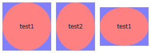
全てのボタンに対して一律テンプレートを適用したければ、スタイルと併用します。
<WrapPanel
  xmlns="http://schemas.microsoft.com/winfx/2006/xaml/presentation"
  xmlns:x="http://schemas.microsoft.com/winfx/2006/xaml"
  >
  <WrapPanel.Resources>
    <ControlTemplate x:Key="buttonTemplate" TargetType="Button">
      <Grid>
        <Rectangle Fill="#8080ff"/>
        <Ellipse Fill="#ff8080"/>
        <ContentPresenter HorizontalAlignment="Center"
                          VerticalAlignment="Center"/>
      </Grid>
    </ControlTemplate>
    <Style TargetType="{x:Type Button}">
      <Setter Property="Template" Value="{StaticResource buttonTemplate}"/>
    </Style>
  </WrapPanel.Resources>

  <Button Margin="5"
    Width="100" Height="100" Content="test1"/>
  <Button Margin="5"
    Width="80" Height="100" Content="test2"/>
  <Button Margin="5"
    Width="100" Height="80" Content="test1"/>
</WrapPanel>
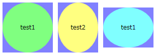
また、テンプレートの適用先のプロパティ値をテンプレートに反映させるためには、 TemplateBinding マークアップ拡張を用います。
<WrapPanel
  xmlns="http://schemas.microsoft.com/winfx/2006/xaml/presentation"
  xmlns:x="http://schemas.microsoft.com/winfx/2006/xaml"
  >
  <WrapPanel.Resources>
    <ControlTemplate x:Key="buttonTemplate" TargetType="Button">
      <Grid>
        <Rectangle Fill="#8080ff"/>
        <Ellipse Fill="{TemplateBinding Background}"/>
        <ContentPresenter HorizontalAlignment="Center"
                          VerticalAlignment="Center"/>
      </Grid>
    </ControlTemplate>
    <Style TargetType="{x:Type Button}">
      <Setter Property="Template" Value="{StaticResource buttonTemplate}"/>
    </Style>
  </WrapPanel.Resources>

  <Button Margin="5" Background="#80ff80"
    Width="100" Height="100" Content="test1"/>
  <Button Margin="5" Background="#ffff80"
    Width="80" Height="100" Content="test2"/>
  <Button Margin="5" Background="#80ffff"
    Width="100" Height="80" Content="test1"/>
</WrapPanel>
サンプル→
VistaLikeButton.xaml 。 Windows Vista ライクなボタンの見た目にする。 XP で実行しても Vista っぽい見た目になるはず。
アイテムコントロールのテンプレート
中身(Content)のないコントロールか、 中身が1つだけのコントロール(ContentControl)に加えて、 ListBox や ComboBox のように、複数の項目を一覧表示するためのコントロール(ItemsControl)もあります。
本題は次節の「データテンプレート」なんですが、 ItemsControl には、「コントロールテンプレート」中で ContentPresenter の代わりに ItemsPresenter を使わないといけないというような違いがある他、 ItemsPanelTemplate というテンプレート機構もあるので、 先に軽く説明しておきます。
まず、最初に挙げたように、 ItemsControl の場合、ControlTemplate 中には ContentPresenter ではなく、 ItemsPresenter を記述します。 例えば、角を丸めた ListBox を作りたければ以下のようにします。
<WrapPanel
  xmlns="http://schemas.microsoft.com/winfx/2006/xaml/presentation"
  xmlns:x="http://schemas.microsoft.com/winfx/2006/xaml"
  >
  <ListBox>
    <ListBox.Template>
      <ControlTemplate TargetType="{x:Type ListBox}">
        <Border CornerRadius="10" BorderBrush="#808080" BorderThickness="1">
          <ItemsPresenter Margin="5"/>
        </Border>
      </ControlTemplate>
    </ListBox.Template>
    <ListBoxItem>1</ListBoxItem>
    <ListBoxItem>2</ListBoxItem>
    <ListBoxItem>3</ListBoxItem>
  </ListBox>
</WrapPanel>

で、この ItemsPresenter の中身そのものの表示方法を変えたければ、 ItemsPanel プロパティ(ItemsPanelTemplate 型)を設定します。 例えば、ListBox の項目を、水平に並べたければ以下のようにします。
<WrapPanel
  xmlns="http://schemas.microsoft.com/winfx/2006/xaml/presentation"
  xmlns:x="http://schemas.microsoft.com/winfx/2006/xaml"
  >
  <ListBox>
    <ListBox.Template>
      <ControlTemplate TargetType="{x:Type ListBox}">
        <Border CornerRadius="10" BorderBrush="#808080" BorderThickness="1">
          <ItemsPresenter Margin="5"/>
        </Border>
      </ControlTemplate>
    </ListBox.Template>
    <ListBox.ItemsPanel>
      <ItemsPanelTemplate>
        <StackPanel Orientation="Horizontal"/>
      </ItemsPanelTemplate>
    </ListBox.ItemsPanel>
    <ListBoxItem>1</ListBoxItem>
    <ListBoxItem>2</ListBoxItem>
    <ListBoxItem>3</ListBoxItem>
  </ListBox>
</WrapPanel>

データテンプレート
ListBox などの ItemsControl の類のクラスは、 ListBoxItem などを使ってアイテムを表示する方法の他に、 データバインディング機能を使って XML や データベース中のデータを一覧表示する機能も持っています。
ListBoxItem を使う場合、 各項目のテンプレートは、ListBoxItem の Template プロパティに ControlTemplate を指定すればできます。 一方で、データバインディングを使う場合には、 データテンプレート(DataTemplate)というものを使います。
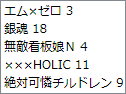
まずは復習ですが、 ListBox では、 ItemsSource プロパティに XmlDataProvider を指定することで、 XML からデータを読み込んで一覧表示することができます。
<WrapPanel
  xmlns="http://schemas.microsoft.com/winfx/2006/xaml/presentation"
  xmlns:x="http://schemas.microsoft.com/winfx/2006/xaml"
  >
  <WrapPanel.Resources>
    <XmlDataProvider x:Key="comics">
      <x:XData>
        <comics xmlns="">
          <item date="2007/5/2">エム×ゼロ 3</item>
          <item date="2007/5/2">銀魂 18</item>
          <item date="2007/5/8">無敵看板娘N 4</item>
          <item date="2007/5/17">×××HOLIC 11</item>
          <item date="2007/5/18">絶対可憐チルドレン 9</item>
        </comics>
      </x:XData>
    </XmlDataProvider>
  </WrapPanel.Resources>

  <ListBox
    ItemsSource="{Binding Source={StaticResource comics},
      XPath=/comics/item}">
  </ListBox>
</WrapPanel>
ここで、 XML の各項目に対してテンプレートを適用したければ、 以下のように、ItemTemplate プロパティに DataTemplate を設定します。
<WrapPanel
  xmlns="http://schemas.microsoft.com/winfx/2006/xaml/presentation"
  xmlns:x="http://schemas.microsoft.com/winfx/2006/xaml"
  >
  <WrapPanel.Resources>
    <XmlDataProvider x:Key="comics">
      <x:XData>
        <comics xmlns="">
          <item date="2007/5/2">エム×ゼロ 3</item>
          <item date="2007/5/2">銀魂 18</item>
          <item date="2007/5/8">無敵看板娘N 4</item>
          <item date="2007/5/17">×××HOLIC 11</item>
          <item date="2007/5/18">絶対可憐チルドレン 9</item>
        </comics>
      </x:XData>
    </XmlDataProvider>
  </WrapPanel.Resources>

  <ListBox
    ItemsSource="{Binding Source={StaticResource comics},
      XPath=/comics/item}">
    <ListBox.ItemTemplate>
      <DataTemplate>
        <StackPanel Orientation="Horizontal">
          <Label Width="100" Content="{Binding XPath=@date}"/>
          <Label Width="200" Content="{Binding XPath=text()}"/>
        </StackPanel>
      </DataTemplate>
    </ListBox.ItemTemplate>
    <ListBox.Template>
      <ControlTemplate TargetType="{x:Type ListBox}">
        <StackPanel>
          <StackPanel  Orientation="Horizontal" Background="#eeeeff">
            <Label Width="100" Content="発売日"/>
            <Label Width="200" Content="タイトル"/>
          </StackPanel>
          <ItemsPresenter/>
        </StackPanel>
      </ControlTemplate>
    </ListBox.Template>
  </ListBox>
</WrapPanel>
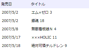
見ての通り、 DataTemplate 中で XML 中の何を表示するかは、 Binding マークアップ拡張の XPath 属性を使って指定します。